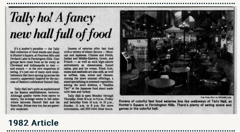
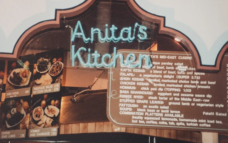
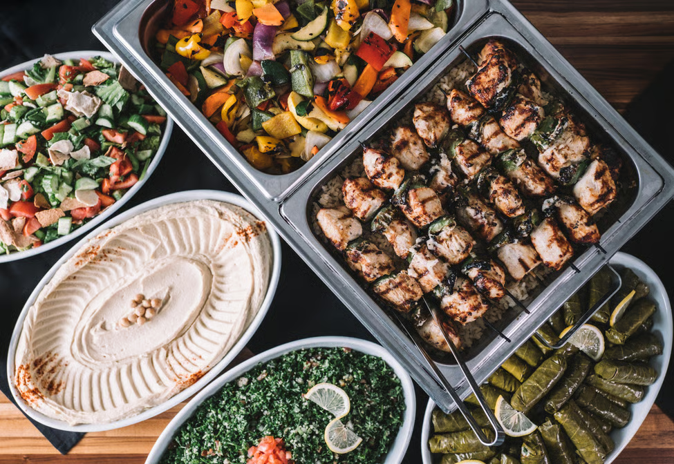
Anita’s Kitchen is a (local chain) mediterranean restaurant that opened its doors in 1981 at the now-legendary Tally Hall food court, where founders Anita and Pierre embarked on a journey to share the fresh and exotic flavors of their homeland Lebanon with the people of southeast Michigan. Anita’s Kitchen enjoyed several years at Tally Hall, complimenting the lineup of international cuisine offered at this once dynamic food court, assisting in pioneering the idea of today’s ever popular fast-casual cuisine concept.
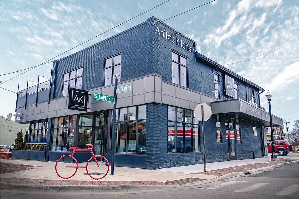
After 3 years of continued success, Anita’s Kitchen decided to brick & mortar with a dine-in restaurant in Troy, Michigan (image seen to the right). Their Lebanese / Mediterranean concept grew in popularity until the need to upsize became more than apparent. This spawned their flagship location in Ferndale, Michigan, where the HQ remains to this day.
The Problem
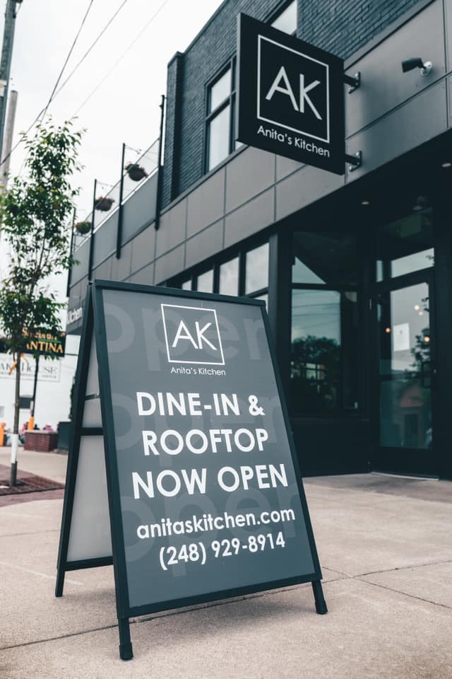
Anita’s Kitchen knew that their food was delicious – this was not the issue. What WAS a problem was their lack of a proper branding and identity package, as Ferndale was rapidly becoming a cultural epicenter of Michigan. They had hired a family friend to come up with some initial menu designs, but never officially had a logo or any sort of cohesive identity.
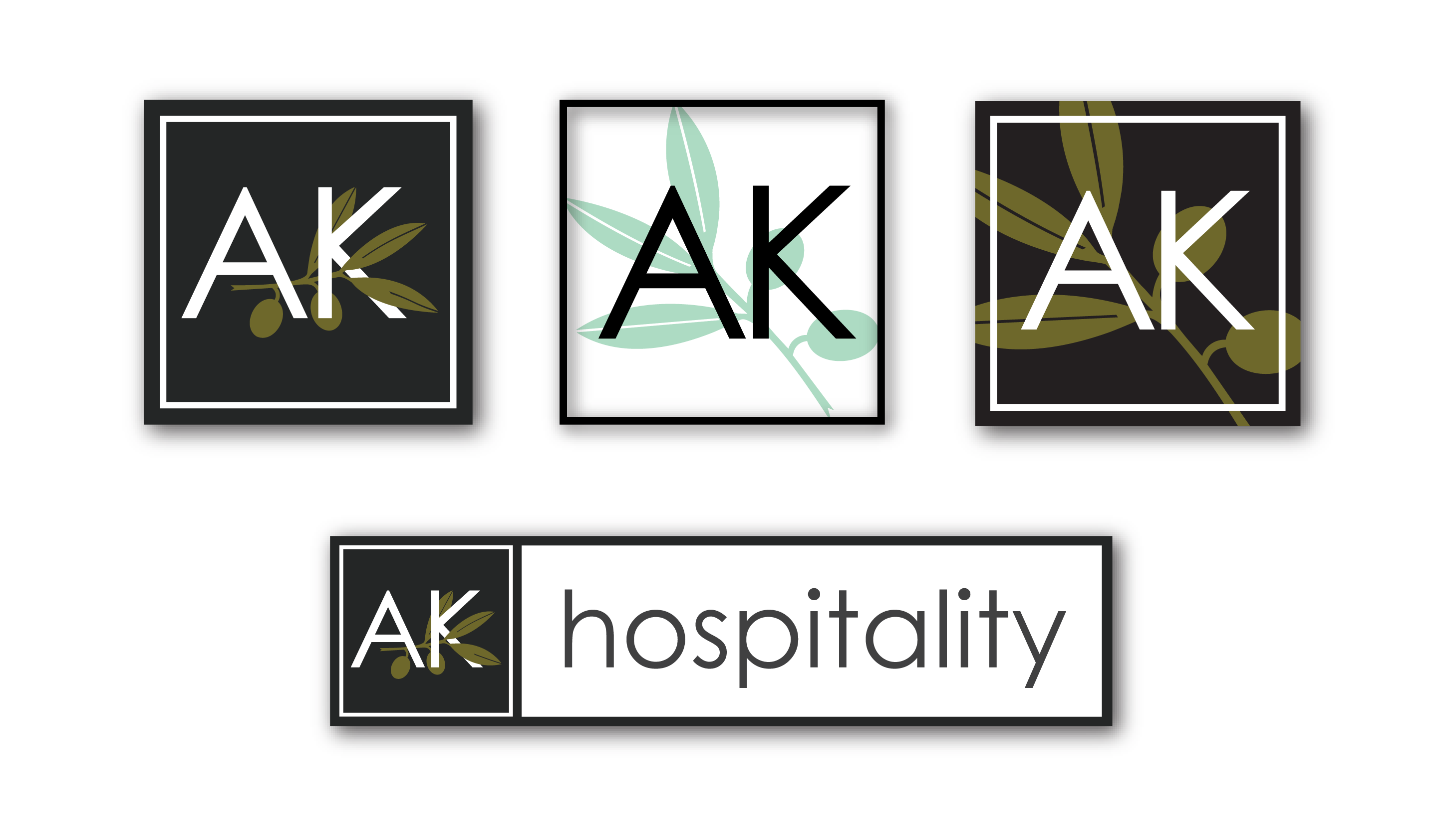
Enter Alex Willy Design (me)
The Solution
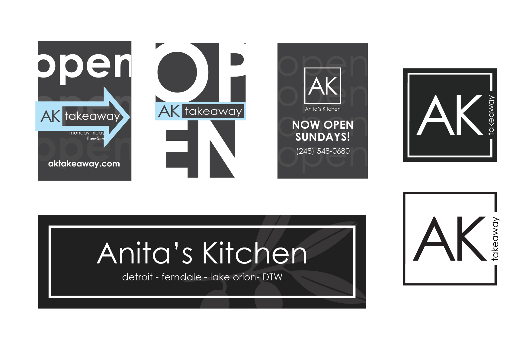
I had posted my graphic design services as a freelancer in various online forums, as well as physical ads on bulletin boards in businesses around metro Detroit, where the owners of Anita’s Kitchen found me and reached out. The process started with a logo, followed by various menu designs, web design, physical banners, posters, merch design, and more.
The OUTCOME
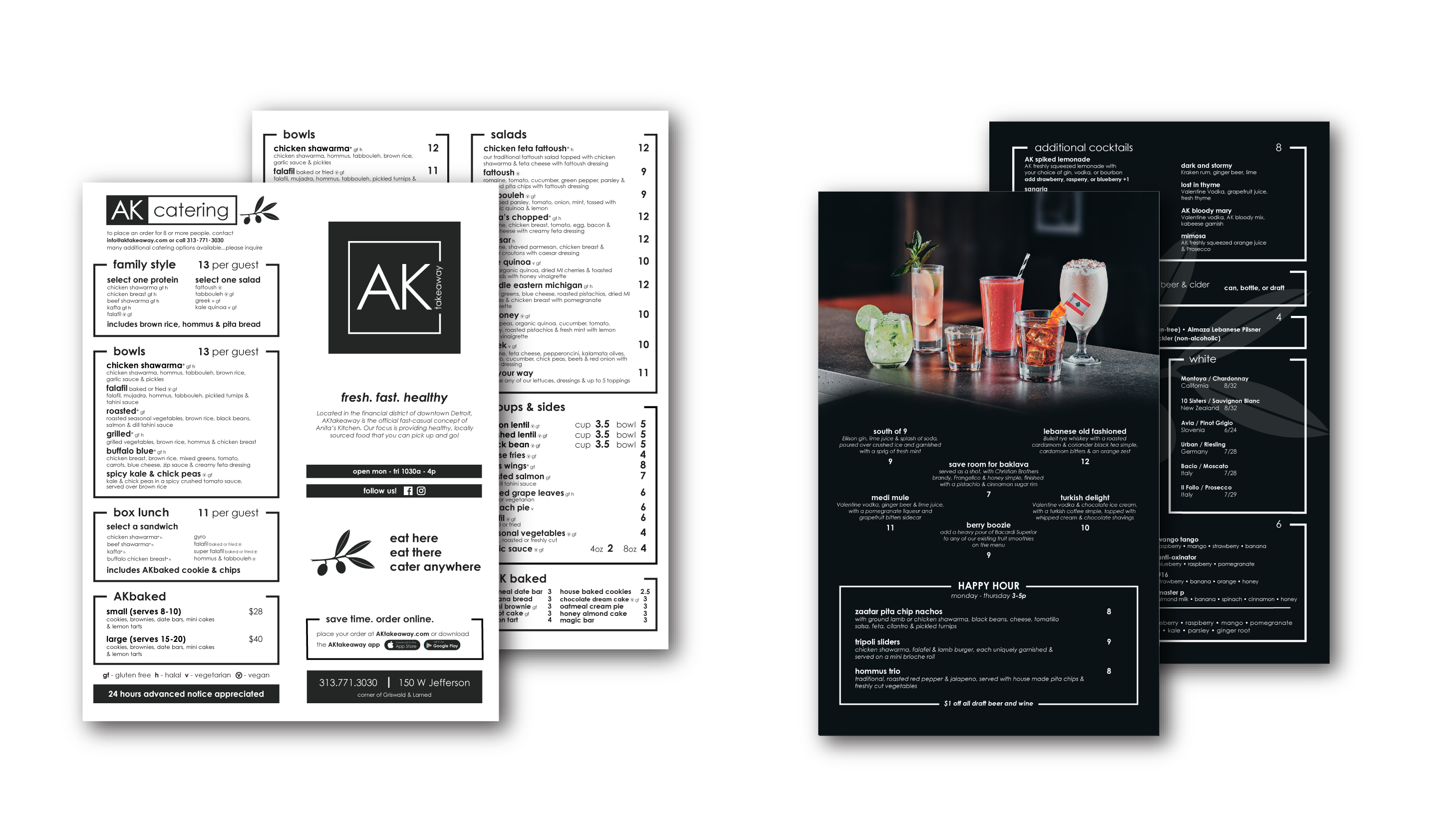
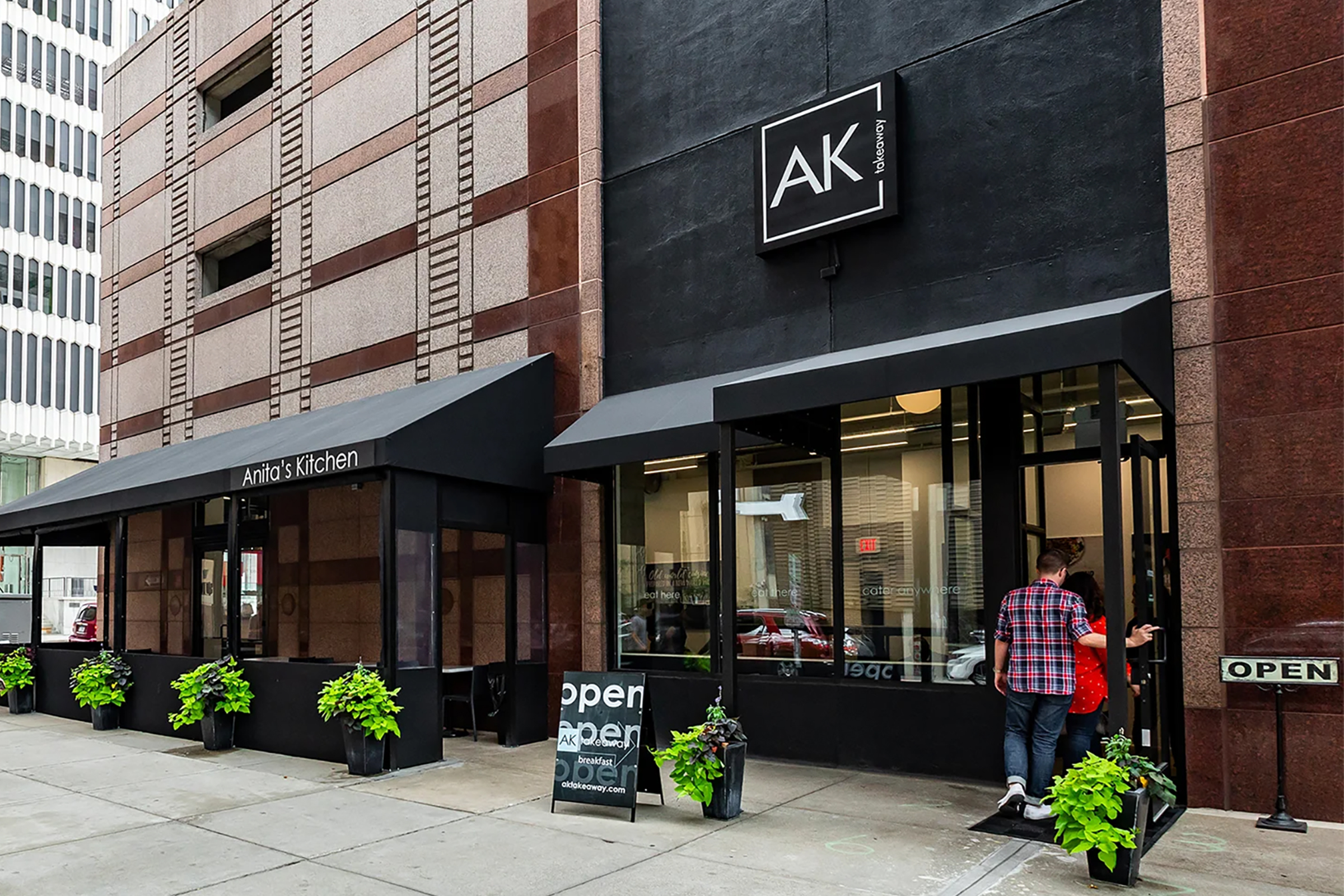
A scalable branding package allowed Anita’s Kitchen to expand from 1 to 4 locations across southeast Michigan, along with placement in the Detroit Metro Airport, where they feed thousands of travelers each week. Intuitive and visually appealing menu designs allow for efficient ordering, along with transparency in regard to allergies and cooking conditions (raw, halal, etc.), which is essential in todays market. This updated, unified identity grows continued trust in the brand due to cohesion between locations, simplified messaging, and impactful graphics.
Revenue increase in first 3 months, post brand-launch
+ 32%
The restaurant experienced a massive push in dine-in as well as take-out traffic once the new brand was reflected on social media + their new website.
Website conversion rate + online order volume
+ 80%
Anita's Kitchen had never pushed online ordering prior to the new branding, and saw an explosion of orders on DoorDash and UberEats, which has not stopped since.
Average ticket size $
+ 11%
Guests now had an appealing and properly laid out menu to order from, with best selling items placed in key positions on the menu to attract the eye.
NATASHA & CHRIS
I recently collaborated with a Metro-Detroit based entrepreneurial couple, Natasha and Chris, to develop distinct brand identities for two of their ventures: SushiRitas, a modern sushi concept in Midtown Detroit, and Olive & Hazel, a handcrafted jewelry brand in Clarkston.
The Problem
Prior to our partnership, Chris and Natasha were navigating the challenges of building two brands without a clear or cohesive visual direction. Early attempts to create the branding themselves led to inconsistent visuals, and messaging that didn’t fully capture the personality or quality of either SushiRitas or Olive & Hazel. They had also attempted working with a family friend for their initial branding, but the outcome fell short—it lacked strategic depth and failed to translate their vision into a strong, scalable identity. As a result, both brands struggled with clarity, consistency, and differentiation, making it difficult to confidently present themselves and connect with their intended audiences.
The Solution
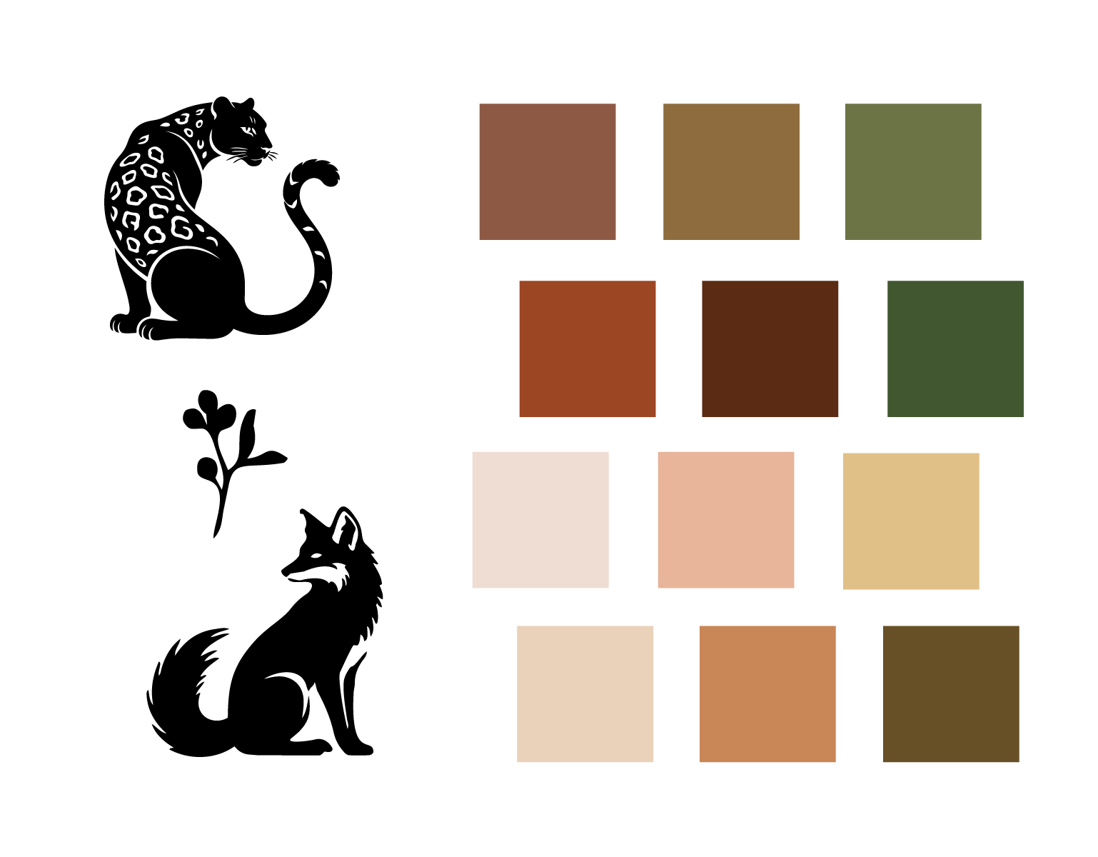
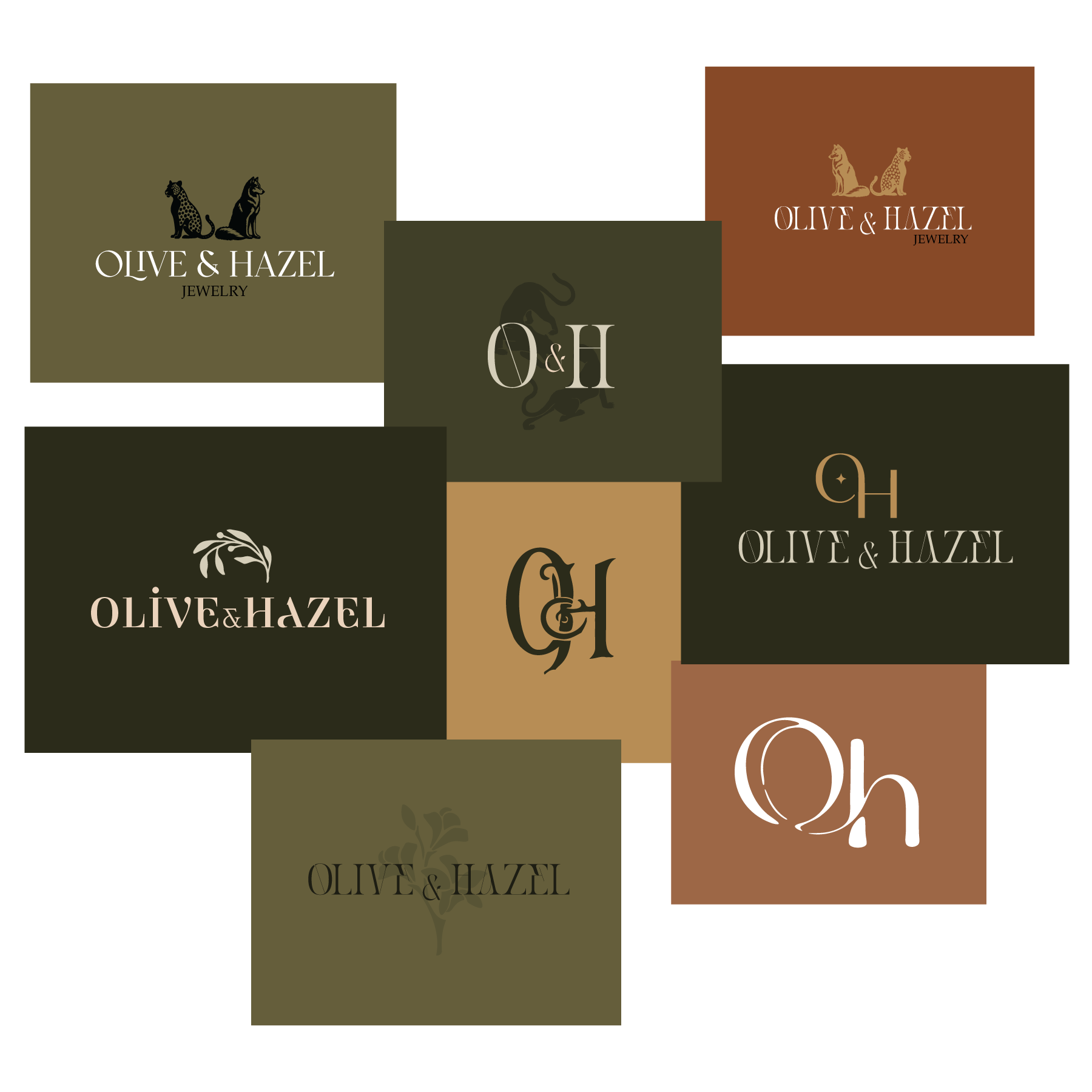
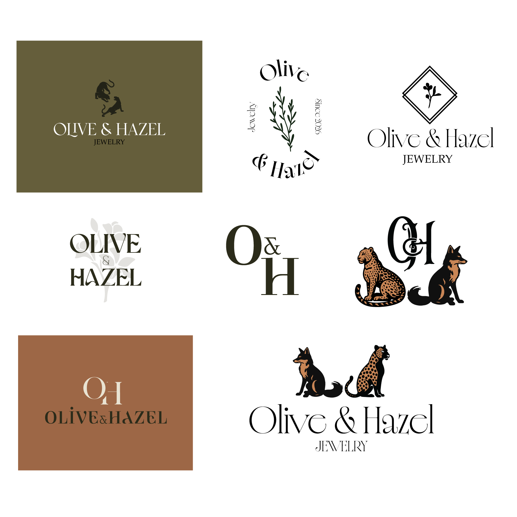
Olive & Hazel are a team of two highly skilled jewelers that specialize in custom wedding rings, but are capable of essentially anything when it comes to jewelry creation. They are both classically trained in metal-smithing and were in need of a brand that would represent their expertise and fine craftsmanship.
For this brand, I developed a refined identity that reflected the brand’s handcrafted quality and boutique aesthetic. The visual system focused on elegant typography, an organic color palette, and versatile branding elements that translated well across packaging, social media, and e-commerce platforms.
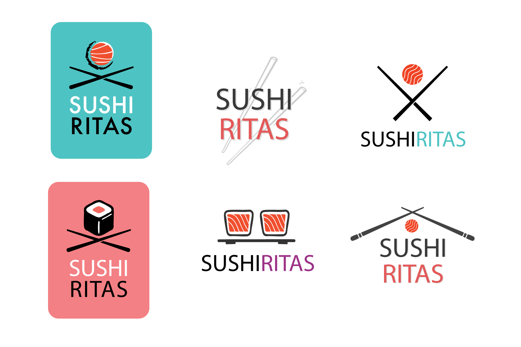
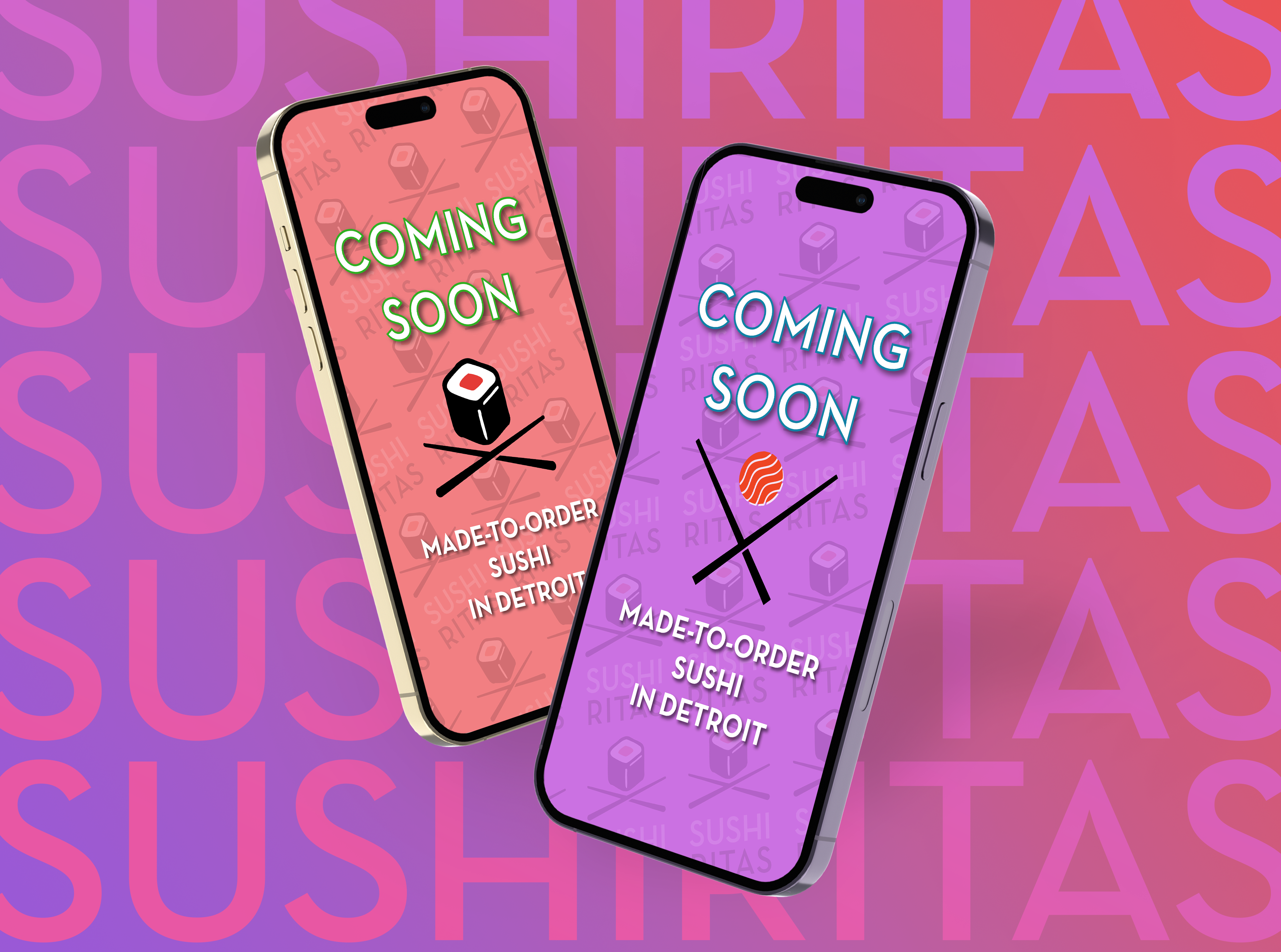
For SushiRitas, I developed a full visual identity that captured the playful, unconventional nature of a “design your own” sushi concept while maintaining a polished and recognizable brand presence. The identity package included logo design, typography, color palette, and brand applications across menus, signage, and digital channels. Their new brand helped establish a clear personality for the restaurant and makes the concept stick out within Detroit’s competitive dining scene.
The OUTCOME
The new brand identities provided both SushiRitas and Olive & Hazel a clear and confident foundation moving forward. With cohesive visual systems in place, both businesses were able to present themselves more professionally across all touchpoints, from physical materials to digital platforms. This consistency strengthened brand recognition and made it easier for customers to understand and connect with each brands’ unique offering.
For SushiRitas, the new identity helped define a distinct personality within Detroit’s competitive food scene, making the concept more memorable and visually engaging. The branding translates effectively across menus, signage, and social media, supporting stronger customer engagement and a more polished in-store experience.
For Olive & Hazel, the refined identity elevates the perceived value of the products, allowing the brand to position itself more confidently within the boutique jewelry market. The cohesive system also streamlines content creation and packaging, enabling more consistent storytelling and a stronger presence online.